Skip to content
Introduction
Color plays a fundamental role in fashion design. The right color combination can elevate an outfit, convey a mood, and influence a brand’s identity. As we move further into 2026, color trends continue to evolve, but the principles of color theory remain consistent. Understanding basic color theory is essential for designers, stylists, and fashion enthusiasts alike, helping them create visually appealing outfits and collections. In this blog, we’ll delve into the fundamentals of color theory and explore how it’s applied in the fashion industry today.
What is Color Theory?
Color theory is a set of principles used to create harmonious color combinations. It’s based on the color wheel, a circular representation of hues arranged by their chromatic relationship. The color wheel consists of primary, secondary, and tertiary colors, which form the foundation for understanding how colors interact. By grasping the theory behind these interactions, fashion designers can manipulate colors to create balance, contrast, and focus in their designs.
The Color Wheel: The Foundation of Color Theory
At the heart of color theory lies the color wheel, which categorizes colors into three main types:
Primary Colors: These are the foundation of all other colors and cannot be made by mixing other colors. The primary colors are red, yellow, and blue.
Secondary Colors: These colors are created by mixing two primary colors. The secondary colors are green (yellow + blue), orange (red + yellow), and purple (blue + red).
Tertiary Colors: These are the result of mixing a primary color with a secondary color. Examples include red-orange, yellow-green, and blue-purple.
Designers use these basic categories to build color palettes that evoke specific emotions or visual appeal.
Color Harmonies in Fashion Design
Once you understand the basics of the color wheel, it’s time to explore different color harmonies. These are strategies that designers use to create aesthetically pleasing outfits and collections. There are several common color harmonies in fashion design, including:
Complementary Colors
Complementary colors are located opposite each other on the color wheel. For example, red and green, blue and orange, or yellow and purple. This color combination creates a strong contrast, making it perfect for bold and attention-grabbing designs. In fashion, complementary colors can add vibrancy to a look, but they must be balanced carefully to avoid clashing.Example: A red dress paired with green accessories for a striking contrast.
Analogous Colors
Analogous colors sit next to each other on the color wheel, such as blue, blue-green, and green. These colors harmonize well together and create a serene and cohesive look. This color combination is perfect for creating soft, monochromatic outfits or layered designs that feel balanced.Example: A pastel blue dress with teal shoes and a soft green handbag for a fresh, understated outfit.
Triadic Colors
Triadic colors are evenly spaced around the color wheel, creating a triangle. For example, the primary colors—red, blue, and yellow—or the secondary colors—green, orange, and purple. Triadic color schemes offer vibrant and balanced compositions, making them ideal for lively, bold fashion statements.Example: A purple jacket with a yellow skirt and red shoes for an energetic and playful look.
Split-Complementary Colors
This color harmony combines a base color with the two colors adjacent to its complementary color. It offers high contrast like complementary colors but with less tension. For example, a blue outfit paired with orange-yellow and orange-red accents.Example: A blue dress paired with burnt orange accessories for a bold yet balanced outfit.
Monochromatic Colors
A monochromatic color scheme uses different shades, tints, and tones of one color. It’s an elegant and timeless way to approach fashion design, creating a polished and cohesive look. Monochromatic outfits are especially popular in minimalist and contemporary fashion.Example: A light pink blouse with a dark pink skirt, accessorized with pink shoes and a pink handbag.
Color Psychology in Fashion Design
Color doesn’t just affect how an outfit looks—it also influences how people feel. This is the essence of color psychology, which plays a key role in fashion design. Designers use color to evoke emotions, set a mood, or convey a message.
Red: Associated with passion, excitement, and energy, red is often used in designs meant to grab attention and create a sense of urgency. It’s a popular color for evening wear, as it symbolizes confidence and boldness.
Blue: Blue evokes calmness, trust, and professionalism. It’s commonly used in business attire or casual outfits that require a more laid-back, peaceful vibe.
Yellow: Yellow represents positivity, optimism, and creativity. However, it can also signify caution or cautionary moods when used in the wrong context. In fashion, yellow adds a fun, vibrant pop of color.
Green: Green is linked to nature, growth, and balance. It’s often used in designs meant to create a sense of harmony, freshness, and tranquility.
Black: A symbol of sophistication, elegance, and power, black is a timeless color in fashion. It’s versatile, slimming, and can be used for both casual and formal occasions.
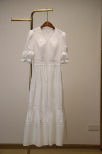
White: White represents purity, simplicity, and freshness. It’s a staple in spring and summer collections, often used to convey a light, airy feel.
2026 Color Trends: What’s Hot This Year?
As we step into 2026, color trends in fashion are reflecting a mix of sustainability, futurism, and nostalgia. Designers are focusing on hues that evoke both optimism and mindfulness, with an emphasis on sustainability and ethical fashion. Some key trends for 2026 include:
Earthy Tones: Shades of brown, beige, and terracotta continue to dominate as consumers gravitate towards earth-inspired, sustainable fashion choices.
Neon Accents: Neon colors, particularly neon green and pink, are making a comeback. These bold and electric hues are being paired with more neutral tones for a modern, edgy look.
Soft Pastels: Light blues, lavender, and pale pinks are emerging as key colors for spring and summer collections. These soft shades evoke a sense of serenity and relaxation.
Metallics: Futuristic metallics in silver, gold, and chrome are popular, reflecting a growing interest in space-age and cyberpunk aesthetics.
Conclusion
Color theory is an essential tool for fashion designers, helping them create designs that are visually appealing and emotionally resonant. By understanding the relationships between colors and their psychological impact, designers can craft collections that connect with their audience on a deeper level. As we move into 2026, color trends are increasingly focused on sustainability, vibrancy, and futuristic aesthetics, offering exciting opportunities for fashion innovation. Whether you’re a professional designer or a fashion enthusiast, mastering color theory will allow you to make informed and creative choices that elevate your style.